Ed Broadbent Waterfront Park Wayfinding App
| Skills: |
Team Lead UX/UI App Design Branding Prototyping |
| Timeline: | 10 weeks |

TeachingCity is a collaborative initiative in Oshawa that connects the City with education and research partners, including Durham College, to address urban challenges through innovation, applied research, and experiential learning. The project focused on creating an accessible AR wayfinding experience for Ed Broadbent Park to enhance visitor engagement. It integrated interactive navigation and real-time information about the park’s history, amenities, and events. The design emphasized accessibility, featuring voice guidance, high-contrast visuals, and screen reader compatibility, making the park more informative and enjoyable for all visitors.
As the team lead, I managed then design process of a mobile navigation app for Ed Broadbent Waterfront Park, focusing on branding, UX/UI design, and AR content creation. I was the primary point of contact for all communications, ensuring clear collaboration between team members, web development team and client. I led the creation of both low-fidelity and high-fidelity wireframes, translating user research into intuitive designs that enhanced the visitor experience.
Additionally, I supported the web development team by providing design assets, ensuring UI consistency, and troubleshooting design-related challenges. By overseeing project timelines, creative direction, and team coordination, I ensured the final product aligned with the Teaching City’s innovation goals.
First Stage: Flowchart Development
In this stage, we mapped the user journey and app functionalities to ensure intuitive navigation. This process helped identify key interactions, streamline app functionality, and eliminate potential pain points. In this stage we also brainstormed key design elements, including colors, logo, and typography, to establish the app’s visual identity.
Second Stage: Low-Fidelity Wireframe Development
In this stage, we created low-fidelity wireframes to visualize the app's layout and basic structure. These wireframes focused on the placement of key elements and user interactions, allowing us to test and refine the overall flow without getting into detailed design. We also began working on the logo design during this stage, exploring concepts that reflected the app’s identity and purpose.
Third Stage: High-Fidelity Wireframe Development
In this stage, we developed high-fidelity wireframes with detailed design elements, such as colors, typography, and images, providing a realistic representation of the final user interface. This allowed us to refine the visual design and ensure consistency across screens. We also began working closely with the web development team during this stage, ensuring that the design was aligned with technical requirements and facilitating smoother integration of the front-end and back-end components. The high-fidelity wireframes served as a blueprint for the development team, enhancing the overall user experience.

Fourth Stage: AR Content Development
In this stage, we visited Ed Broadbent Park and used a 360-degree camera to capture key areas for the interactive AR experience. This process allowed us to gather immersive visual data, ensuring accurate and engaging content for users. The captured footage serves as the foundation for AR integration, with interactive elements set to be further developed and implemented in the app’s next stage.
Logo development
During the logo development stage, we brainstormed several potential names for the app, including “Compass,” “Adventure Map,” and “Pocket Guide.” After evaluating the options, we finalized “Pocket Guide” as the app's name, which reflects the app's purpose as a portable navigation tool.
The logo was designed to represent a compact, easy-to-use map, symbolizing the app's functionality of guiding users through the park with ease and convenience. This stage was crucial in defining the app's visual identity and ensuring it aligned with the overall user experience.
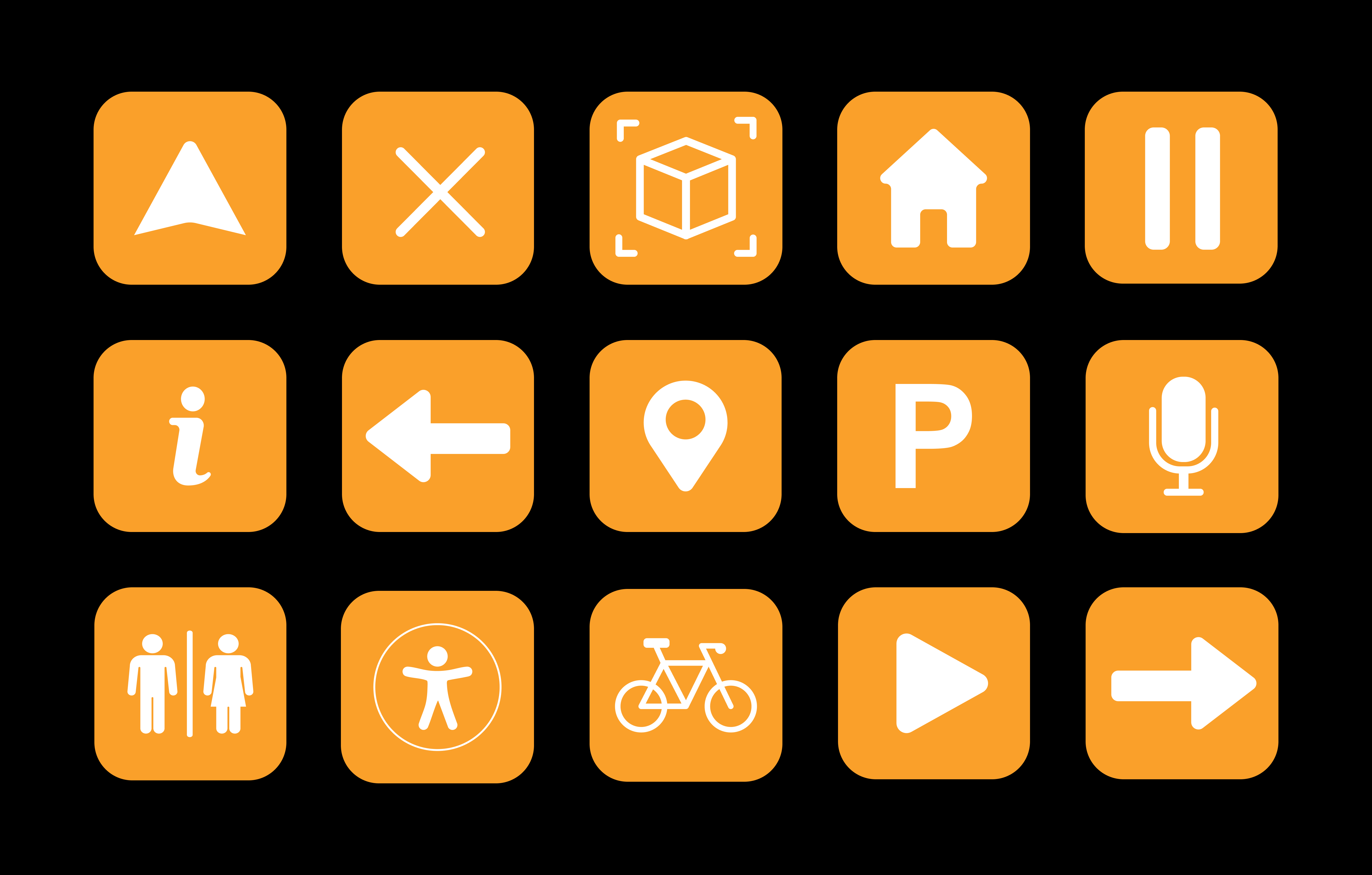
Iconography
In the iconography development stage, we focused on designing clear, intuitive icons that would enhance the user experience and support the app’s navigation. Each icon was created to be easily recognizable and aligned with the overall branding, ensuring consistency across the app. The icons were designed to represent key features and functionalities, such as location markers, points of interest, and interactive AR elements. This stage was essential in ensuring that the app was visually cohesive and user-friendly, enabling seamless navigation for all visitors.
Signage Design
In the signage design stage, we created a detailed map of Ed Broadbent Park to assist users in navigating the space easily. We also developed AR signage designs that incorporated QR codes, which, when scanned, would direct users to the app for interactive features. These designs were crafted to be visually clear and informative, allowing users to easily identify locations and access real-time information about key points of interest, enhancing their overall experience at the park.
